Hi Jachym,
Many thanks for the recent update to V18.0. It's great to see that you're still developing Meteotemplate and have exciting future plans. I understand that you want to modernise the site and make it more responsive, which is great, but like many others, I have always enjoyed having a comprehensive single-column Mobile page separate from my two-column Desktop page.
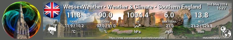
Desktop: http://www.wessexweather.net/meteotempl ... esktop.php
Mobile: http://www.wessexweather.net/meteotempl ... Mobile.php
I have never used the bundled mobile page you introduced in V17.0 but fully understand why you added it. I have always carefully set the screen width overrides within the Main Setup so that my iPad showed the Desktop page and my iPhone the Mobile page. V18.0 has broken this, so that I can only now view the Desktop page properly with my iPad turned into landscape. In portrait mode I see a single column with the items in my second column simply following those in the first. My site has been designed to show certain pieces of information side by side in the two columns, and this new responsive design has broken this. If anyone can suggest a setting to change this, i.e. to display the normal two-column Desktop page on my iPad in portrait, I'd be most grateful.
Your recent blog suggests that you are goinjg to make indexMobile.php obsolete, and I would urge you please to reconsider this, and to continuing making this an option for us in the settings.
Jachym, please, please, PLEASE keep the customisable Mobile page!
-
WessexWeather

- Forecaster

- Posts: 127
- Joined: Mon Aug 21, 2017 6:26 pm
- Location: Wimborne, East Dorset, UK
- Station model: Davis Vantage Vue
- Software: Meteobridge
- Contact:
Jachym, please, please, PLEASE keep the customisable Mobile page!
Regards,
Simon (WessexWeather)
Simon (WessexWeather)
Re: Jachym, please, please, PLEASE keep the customisable Mobile page!
I am also in this boat. I have set up inexpensive tablet as a weather display showing my meteotemplate page in fullscreen mode. It has been working great until v18. Before v18 i saw all of my 3 columns but now with the responsive design it pushes 3rd column underneath everything else. Maybe there is some custom width parameters i could set in config to stop this happening but i havent find any what help.WessexWeather wrote: ↑Mon May 11, 2020 11:59 am My site has been designed to show certain pieces of information side by side in the two columns, and this new responsive design has broken this. If anyone can suggest a setting to change this, i.e. to display the normal two-column Desktop page on my iPad in portrait, I'd be most grateful.
-
livefeed
- Observer

- Posts: 20
- Joined: Sat Jan 26, 2019 6:05 am
- Location: Lusby, MD
- Station model: Davis pro 2
- Software: Meteobridge
- Contact:
Re: Jachym, please, please, PLEASE keep the customisable Mobile page!
I am in the same situation, the mobile layout does not change even though I make edits. Anyone get this working?
-
FSC830
- Forecaster
- Posts: 139
- Joined: Thu Aug 02, 2018 11:40 am
- Station model: Davis Vantage Pro2
- Software: Meteobridge
Re: Jachym, please, please, PLEASE keep the customisable Mobile page!
At least at my 10" tablet I can see the indexMobile with 3 columns in portrait and landscape orientation
Regards
- mobile_p.png (354.58 KiB) Viewed 256 times
- mobile_ls.png (621.97 KiB) Viewed 256 times